Is a career in data right for you? Dive into answering this question through data.

If you’ve done a google search regarding careers in data, you may have seen headlines such as, “Sexiest job of the 20th century: data scientist,” or “The need for data professionals is expected to grow exponentially.” Indeed, reading such statements enticed me to look more into a career in data.

While I’ve worked with data for several years on a nearly daily basis as an academic researcher in training, I knew very little about data careers in the industry. What better way to learn more about this than to go through actual data itself?

Here are the personal research questions I posed:

1) What the common jobs in the field are, 2) what the general job aspects are, and 3) what educational background and skills are required.

Who stands to benefit from this information?

If you’re like me and are also considering a career in data, you may find this information insightful. Even existing data professionals may benefit from this information since they can see how they stack up to others or compare across different roles and countries.

How do I answer my question?

My first step was to find a dataset that contained the relevant information to answer my questions. Lately, I’ve been troubleshooting a lot of my data-related questions on a site called Stack Overflow. Many helpful suggestions from experts in data, or even just data enthusiasts can be found there. Something the site does annually is conduct a survey among its users. Though a lot of Stack Overflowers are developers/programmers/computer scientists, a decent share of them are data professionals. I decided to capitalize on this dataset and learn about data careers from the Stack Overflow community of data professionals.

After the data were downloaded, cleaned, and wrangled, I opted to create a Tableau story with 3 dashboards of several visuals that touched on the following broad topics in dashboard 1: an introduction to the field and common roles, dashboard 2: overall role environment (e.g., benefits, work life balance); and in dashboard 3: overall role requirements (e.g., education, job-related tools/skills).

I present to you, the Tableau Story:

(or click here to view via Tableau Public)

Data and design decisions.

Because my research question was a two part one, I thought a story made up of 3 dashboards would be most appropriate. On the latter 2 dashboards, you can filter all of the visualizations by role and country.

For design elements, I chose to use a modern looking clean, but bold title in the form of a question because that’s what the story is trying to accomplish, to answer the question. I accompanied the titles with vectors of data analytics-themed graphics. The color scheme of the story is in a cool tone and kept consistent throughout.

First, I added a brief summary to introduce the field of data analytics, why it might be of interest and a statement on why the viewer might benefit from the visual.

Dashboard 1:

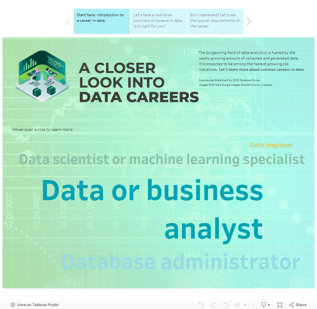
In this first dashboard, have a brief summary on the upper right to tell the viewer about the field and the purpose of the project. I chose to make a wordcloud of the data roles in the dataset so the viewer has a quick glance of the most common roles, where the larger the font, the more popular. If they are interested in learning more about a particular job, they can hover to reveal a description and the number of individuals with that title in the dataset. I kept this first dashboard simple as to not overwhelm the viewer with information.

Dashboard 2:

I chose to use big bolded numeric values to visualize the salary and work hours. Typically when people consider a job, these are some of the top influencing factors. I felt that this representation made the numbers really stand out.

To get more details about other environment factors, I used different chart types. A tree map was used to depict the distribution of professionals across companies of varying organization size. A bar chart was used to show the percentage of data professionals and their overtime requirements. Finally, a bubble chart was used to represent job satisfaction ratings among data professionals. I turned the bubbles into faces corresponding to the rating scale.

Dashboard 3:

First, I represented both educational components using bar charts because there were numerous categories involved.

For the skills, I chose to use big bolded numbers for emphasis, as these are generally quite important job requirements. Though the last visualization of the top programming languages, I chose to do sort of similar to a bubble chart, where the logos of the languages are shown. Though size couldn’t be utilized in this chart due to the nature of the data that was given.

Next steps.

There were a few suggestions to refine the dashboard further. For example, some filter combinations returned blanks due to having no data. I tried to use a workaround whereby I would use a titled “No data available” text field right under each visualization, which should appear if the visual goes black, but the text still showed up on my bold text figures because they weren’t large enough to hide it. This method did work for charts that were large enough to hide the tiled text, though. The other issue I wanted to resolve was to be able to display a percentage rather than a numeric value for the common programming languages visual. Unfortunately, due to the nature of the data, I also could not get a formula to work because I had two dynamic dependencies. A percentage would be able to be displayed for a single role across the dataset, but the formula wasn’t able to adapt to a country selection and if a different role were selected. Thus, I decided to leave it as is.

Compiling the data for this project made me realize how much or how little we can answer our research questions depends on how the experiment or survey was conducted. You have to work with what you’re given.

I drew important insights from my completion of this project. From my own exploration, it looks like it is in my best interest to stay in the United States if I were to consider a career in data. Requirement-wise, I must admit that I am intimidated by the amount of programming/coding that is involved in these jobs. I’d love to create a follow-up visualization where I would incorporate time to see the temporal trends in the career field.

Dear food diary: Understanding my eating patterns and habits through data (PROJECT 2)

Some people eat to live, but I’m in the camp that lives to eat. I consider myself a foodie: a person who is very interested in […] eating different kinds of food (Oxford, n.d.).

As a scientist in training, I knew better than to make a baseless claim without any supporting evidence, so I sought to do a quantified self (QS) project. Broadly speaking, the quantified self movement is about learning about oneself, or addressing a personal research question through data.

Here is the personal research question I posed:

Do my eating patterns (e.g., frequency, diversity of cuisines and meal types) reflect and warrant my self-proclaimed “foodie” title?

Note: The average American eats out roughly 4.9 times a week per year (Zagat, 2018), or 254+ meals a year, so I aimed to exceed that. As for number of cuisines, I didn’t have an average consumption statistic, so I set personal goal of at least 10.

Who stands to benefit from this information?

I would consider myself as the primary beneficiary from this information, as I would be deriving self knowledge. It would be personally useful in several ways: 1) I can use the information I obtain to help me decide on what cuisines to eat (e.g., was there a cuisine I particularly preferred, were there some I seldom had or have yet to try?), 2) it can provide insight on ways I can diversify my meals, and 3) it can serve as a diary since I will annotate memorable meals and also events that may have influenced my eating habits.

However, I can see it potentially benefitting people who may be interested in where and what I eat. I have had friends and social media followers ask me questions about food spots and recommendations in the past, so this might be helpful for those individuals.

How do I answer my question?

My first step was to gather information about the meals I had in a given timeframe, I decided to start from the beginning of last year, January 01, 2019. While I didn’t have written records of every meal I enjoyed, I am one of those people that takes photos of a lot of their meals. My friends joke that my camera eats before I do.

The photos came in handy; I ended up going through my camera roll and instagram stories and recorded the date, cuisine type, meal type, and location (thanks, metadata!) of every meal I had on record.

I also happen to be a regular user of reservation applications and food delivery services, which kept records of the aforementioned data as well.

After all the data were entered and organized, I opted to create a Tableau dashboard of several visuals that touched on the following: how frequent I ate, how diverse my meals were (both cuisine and type-wise), where I ate, how I obtained my meals, and my eating habits across time.

I present to you, Dear food diary:

(or click here to view via Tableau Public)

Data and design decisions.

Because my overarching research question was multifaceted, I thought a dashboard would be most appropriate. Each chart or data-object within the dashboard represented data from the same timeframe: January 01, 2019 to October 23, 2020.

I chose to title the visualization “Dear food diary,” and signed it off with “Sincerely, Melissa,” in a handwritten script font to emphasize the personal aspect of the project. Food elements (e.g., letter O as a dinner plate and food vectors below the text) were utilized to add to the food theme. Like a “diary,” I organized the dashboard to be read from up to down, left to right. The color scheme is a light one, based on personal preference (which I felt was appropriate for a diary-like design) and kept consistent throughout.

First, I added a brief summary to introduce the research question and highlight in a different text color the overall conclusion I came up with after going over the data.

Next, I decided to use big bolded numeric values to visualize how many meals I had and how many cuisines I had tried. These were my primary questions and were the metrics I would use to answer my question. I felt that this representation made the numbers really stand out.

To get more details about where, what, how, and when I ate, I utilized several charts.

Where: I mapped out all of the locations of the meals I had via a geographical heat map, with darker colors representing areas my “hot spots,” or places where I eat at more. If the viewer hovers over a dot, they are able to see when I had the meal, what meal and cuisine it was, and a more details on the location.

What: I used a tree map to depict which cuisines were my favorites. A tree map is appropriate because I wanted to show all the cuisines I had tried, but highlight my go-to’s since they would be occupying the most surface area and be darker in color.

How: To see which method I used most often, I chose a donut (adaptation of a pie) chart because I wanted to show proportions and I only had 3 categories (in-person, delivery, takeout). It’s easy for the viewer to see which category occupies the largest piece of the donut.

When: Originally, I considered a line graph because I was interested in temporal trends, but as I started to model the data, I realized that some of the meals could get “lost” that way. In other words, I wanted to find a way to be able to view my eating patterns across time, but additionally represent the data such that I could show the viewer snippets of a particular week. I had so many fantastic meals and memorable moments associated with them that I wanted to incorporate it. This was supposed to be a diary, after all. It was then when I figured that I could do much more with a circle view graph. I represented meal type by color and method by shape, with number of meals on the y-axis and week on the x-axis. I also inserted annotations of important events that had happened during the time period and photos of some of the meals that I had, viewable via the tooltip. The top circle graph was for the year 2019, whereas the one on the bottom is for 2020. I decided to go with two to further emphasize the difference in frequency and diversity of my meals last year compared to this year.

Next steps.

Compiling the data for this project made me realize how much richer the story could have been had I made more detailed records. It would be interesting to examine the cost of my meals, my rating of the meals, and perhaps even record my subjective feelings prior to purchasing the meal and thereafter.

I drew important insights from my completion of this project. I met my own criteria of a “foodie,” but now I had several more questions. Was Japanese cuisine a top cuisine because I had spent nearly two months in Japan? I try to could filter out those study abroad dates and see whether its ranking still stands. It also appears that I eat more often and a greater variety of meal types when I am traveling. In fact, as the shutdown happened, my meals grew increasingly homogenous, almost always delivery lunches. It’d be great to follow-up on this project and see my habits once the pandemic is over.

Has NYC PAUSE impacted 311 dirty condition complaints? (PROJECT 1)

They say that the smell of New York City is one that is unforgettable. Descriptions include “rotting garbage,” “rancid,” “dirty,” and even “like death,” just to name a few. Living in a city with a population of 8 million plus makes it inevitable that the streets are rife with garbage and the subsequent odors that accompany it. But when do the dirty conditions of NYC evolve from discomfort to potentially dangerous? Well, we’re living in these times now – when a global pandemic hits. The first known COVID-19 case in metropolitan New York was confirmed on March 1, 2020. Within a few weeks, the city had become the country’s epicenter of the pandemic. By March 22, 2020, a statewide executive order to close non-essential business until further notice was put into effect to slow down and manage the spread of the virus. It’s not that the city’s trash problem caused the sudden concentrated surge, but if left unchecked, it has the potential to exacerbate the number of COVID-19 cases. The World Health Organization states that sanitary and hygienic conditions are critical to protecting human health during an infectious disease outbreak. Consistent and thorough waste management and sanitary practices can mitigate the transmission of COVID-19 (WHO, 2020).

With all of this in mind, I was curious about whether the shutdown had impacted the city’s dirty conditions and sought to answer it empirically.

Thus, I posed the following research question:

How has the volume of sanitation complaints changed since NYC PAUSE began? Is the pattern of complaint volume during NYC PAUSE any different from the previous 2 years in the New York metropolitan area?  

 Who should care about this?

Multiple parties can benefit from the answer to this research question – Government officials and workers, particularly those in the Department of Sanitation, and people who live within (or are planning to move to) the New York Metropolitan area. A better understanding of complaints that involve dirty conditions can help government officials and workers allocate their resources more efficiently and keep the New York City area clean. This information is also important to ALL of us in the New York metropolitan area because it gives us information about which areas have the highest number of dirty condition complaints, and potentially avoid them until we see the numbers decrease. This information is especially important during the pandemic as sanitary practices and living conditions make virus transmission less likely. A clean environment and surroundings also have a positive impact on one’s living conditions. 

How do I go about answering this?

 I first leveraged the open 311 complaints data available here. It is an extremely rich data set, so I filtered it by taking the “dirty conditions” complains made in all five boroughs of metropolitan New York, organized by date from 2018 to present. I then made a dashboard of the following 3 charts: 1) an area chart illustrating the number of dirty complaints by borough, 2) a stacked bar chart that portrayed the different types of complaints and their respective counts, and 3) pie charts depicted the status of the complaints. All 3 charts showed the time period from March-June in 2018, 2019, and 2020.

Here is the dashboard:

(or click HERE to view it directly on Tableau public)

Now let me walk you through on the data and design decisions I made.

As I mentioned earlier, I chose to create a dashboard with multiple charts. The reason for this is because there were follow-up subquestions relevant to the overarching research questions that could be answered via additional charts. Moreover, each chart visualized three time periods: March-June 2018, 2019, and 2020. I included the prior 2 years to use as a comparison to this year when the pandemic was in full swing. Only March through June are shown because these were the months when PAUSE was in effect.

An area chart was selected to address whether the volume and pattern of sanitation complaints changed since NYC PAUSE. Unlike a line chart, which only represents time-series data, an area chart accomplishes this and can additionally account for volume as well. I then organized the number of complaints by city to help the viewer hone in on which cities experienced the most complaints. I also added an annotation to highlight when PAUSE so the viewer can view the immediate and subsequent effect it had on dirty condition complaint volume.

Next, I wanted to know what types of complaints were the most frequent. To answer this, I used a stacked bar graph because I wanted to highlight the difference in complaint numbers across condition types. The stacked bar takes into account that I have two categorical variables: time period on the x-axis and condition type represented by colors. The stacked bar chart allows the viewer to quickly pick up on what type of condition was most commonly complained about.

Now that we know where and what those complaints were, I wanted to know what their statuses were. Are the cases still open or resolved? Are the numbers vastly different this year than the prior 2? To do this, I chose pie charts to show the proportions of the complaint statuses. Not only did I want to emphasize the difference in complaint numbers, but also depict how many were in each status category.

Finally, I’d like to discuss some of my aesthetic design choices. I chose a “dark” color scheme because like many, I consider these days to be “dark times.” My title reflects what the project is about and I added a bit of a graphical design element where I used a vectorized silhouette of the NYC skyline to further emphasize the geographical location the data pertains to. I also added layman titles to each chart as well as a caption with further elaboration. As an academic with a “hard sciences” background, I have a tendency to be at times, overly descriptive and jargon-y, so I tried to keep the audience in mind with the chart headers and brief background snippet on the upper right. I also highlighted in yellow the main takeaways.

Final thoughts.

All in all, it was a pleasure undertaking this project. This was the first Tableau dashboard I made with minimal guidance and I am relatively pleased with the outcome. I was able to capitalize on publicly available data to derive insight that could have an impact on public health. Moving forward, I’d like to expand on this project as NY FORWARD progresses. It coinciding with the flu season would be interesting to examine. It would also be more informative if I could combine the 311 NYC data with COVID-19 data to explore whether the geographical areas with high dirty condition complaints experience a greater number of virus cases.

New Post!

About Posts

This is a Post. Instructors often post announcements, assignments, and discussion questions for for students to comment. Some instructors have students post assignments. Posts are listed on the “Posts” page with the newest at the top. 

Post Comments are turned on by default (see Home for information on Comments).

Add/Remove a password from this post from the Post Editor > Visibility > Edit > Password Protected.

Add/Edit/Delete a post from Dashboard > Posts